Thursday, November 30, 2006

Marker


This is the final of many reworks. The assignment was to create an illustration based off a letter in the alphabet. The letter itself and also subjects/objects/images that begin with the letter were to be incorporated into the piece. The inclusion of a value gradation and figure/ground reversal was also necessary. Although rather conspicuous my letter was the letter F and it can be seen in the woman’s hair. Female, Fertility (represented by the pregnant maiden and the lotus flowers), Flowing, and Flowers became the subjects of the work. Within the piece I tried to capture innocence and purity through a whimsical look and childlike face of the mother.


This was the original idea for the final piece above. This and the following four below were rough drafts for the assignment.


The letter J (seen in the Jaguars tail)


The letter M


The letter L


The letter M

Prints


The original stamp


Rotating the stamp to create different designs


Repeating the designs to create a pattern


Using acrylic instead of ink. This piece is the design for the back of a deck of cards.

Photography


These two pieces pertain to the need to wash yourself clean of dirty acts and sin. The newspaper article, which inspired the pieces described the need for people to wash themselves physically if they feel dirty from sinful acts. It has been discovered that when hit men go through with a gruesome murder, the next day they will hit the spa for a day of cleansing. The photographs exhibit the irony in this human tendency, the woman even if she is drowning in the water in a drastic effort for purification she is unable to get clean. Her guilt stays with her signified by the expression of grief worn on her face.


These photos were not altered afterwards on a computer, through a series of techniques I was able to create the effect without a picture editing program.


This was the original subject, an asian mask made in the 17th century.


By using a scanner, and moving the image constantly while the scan was in process I was able to bring about interesting distortions of the image.


As the woman was supposed to be drowning I searched for a way to make her appear as though she was under water. What worked well was to fill a plastic zip-lock bag with water and place it over the image, the air bubbles inside the plastic and the reflections of the light gave an underwater appearance.

Pastel


Colored Pencil

Conte Crayon


Part of a larger theme pertaining to isolation and introspection.


Inspired by the work of Jim Dine.


Wednesday, November 29, 2006

Charcoal


These nude figure drawings were created while taking a college class at Lyme Art Academy in Old Lyme, CT. The class met for one week, 4 hours a day. The professor, Hollis Dunlap, is acclaimed for his knowledge of anatomy and realistic work. His notes and help with anatomy can be seen scribbled on the sides of my work.


3 hour composition.


3 hours.


30 minutes.


3 hours.


Not a part of the Lyme Academy class. This is a study from a photograph of an Ambercrombie and Fitch model.


10 minutes. Done in my private art lessons at the BAY.


10 minutes.

Graphite


A sign language signature, my name in sign language. Done through the observation of my own hand.


Self portrait.


Acrylic


Still life of the prom aftermath. It was interesting to me that the cosmetics looked like a work of an art themselves, each item had a beautiful design, and the many reflections of light made them look like gems.


This piece is showing how important, how powerful one moment can be. When the details all fade away and the situation no longer matters, just the other person who is there with you. One glance can hold a power unexplainable. In these moments it is almost as though one escapes reality, if only for a moment. Notice the unexplainable, unworldly light source emanating from the woman.


Although these are inanimate objects I have tried to convey a sense of loneliness, isolation, and rejection. While three larger bottles stand together sharing a lovely carnation, the other bottle stands alone, forced to dwell in the shadows of the other three.


This work is titled "Fierce against the Heart". It relates the story of the heart wrenching journey of depression and agony that my sister when through when she was betrayed by her fiancé and therefore ended the relationship. In her darkest times she seemed detached from herself, in a deep depression jailed by the overwhelming thoughts of him and their time together. This time is represented by the way she is disintegrated at the beginning and the many well focused pictures of her fiancé that surround her, since he still has power over her at this point. As you move left to right my sister gradually becomes stronger and is able to define herself, separate and strong. Her figure becomes more realistic and defined, as the pictures of James and his power begin to fade away. At the end she has decided to leave the depression and grief behind, and turn the page into a new chapter of her life, a chapter that is full of hope and happiness. "Je Commence" written in black ink translated from French is "I Begin". Her breakup is a memory now, something that has shaped her in some ways and given her wisdom, but does no longer define her or control her. She no longer lives in the agony of the breakup every day of her life, she has lifted the bondage and she starts a new.


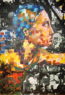
In the peice I worked with acryllic, pastel, photocopied pictures, and ink prints. I constructed a print made of rubber and repeated the cell design to create a net like structure in the background, this is in regards to my sister being tanlged and held back (as if she was netted in) in the sorrow by the thoughts of her fiance. The second half of the peice hangs in her room as a tribute to her survival.


I created this peice for the Junior Federal Duck Stamp Contest in 2006. I was given an honorable mention.


The following are part of a project to create a deck of cards. The entire deck revolves around the theme of Greek mythology and each suit has a theme: Clubs are the Gods, Hearts are the Goddesses, Diamonds are the Demi-gods and Heroes, and Spades are the mythological creatures.


This is to be the design on the back of the deck of cards. The colors in this piece are all derived from mixing the two complimentary colors green and red, with the addition of white and black for tints and shades.